Paris. The Martin Parr exhibition at the Jeu de Paume is in full swing. With 14,354 visitors for the first week of opening, it ranks among the highest attendance numbers along with “Diane Arbus”, “Berenice Abbott/Ai Weiwei” or “Richard Avedon”, indicates the art center which has extended its opening hours during the weekend from 10 a.m. to 7:30 p.m., instead of 11 a.m. to 7 p.m. The catalog, co-published with Phaidon in 7,000 copies, is currently being reprinted for both French and English editions.
Conceived by Quentin Bajac with the photographer before his death on December 6, and the gallery owner Clémentine de la Ferronière, the exhibition revisits a large part of the work over fifty years “in the light of reading the photographer’s blog and his positions in the interviews which came back more and more, and in a more worried manner than in the past, on the excesses of our lifestyles and the dilapidated state of our planet”, explains the director of Jeu de Paume. Fifteen years after “Planète Parr, The collection of Martin Parr”, organized in these places by the Haus der Kunst in Munich, in collaboration with the Parisian establishment, a change of register with “Martin Parr, Global Warning”.
Martin Parr (1952-2025), Dorset, England2022.
© Martin Parr / Magnum Photos
The 2009 exhibition, signed by Thomas Weski and designed by Jasmin Oezcebi and Franck Vinsot, combined on both levels of the institution, photographs by Martin Parr and his collections of postcards, photographs, photo books and figurative objects accumulated over decades. Many things were said about the man, the photographer, the collector and his attachment to documentary photography.
Today, the gaze focuses solely on his photography. It becomes more analytical and also appears more condensed. It only develops in the spaces of the first level of the Jeu de Paume. Those on the ground floor are dedicated to Jo Ractliffe.
A journey focused on his documentary work
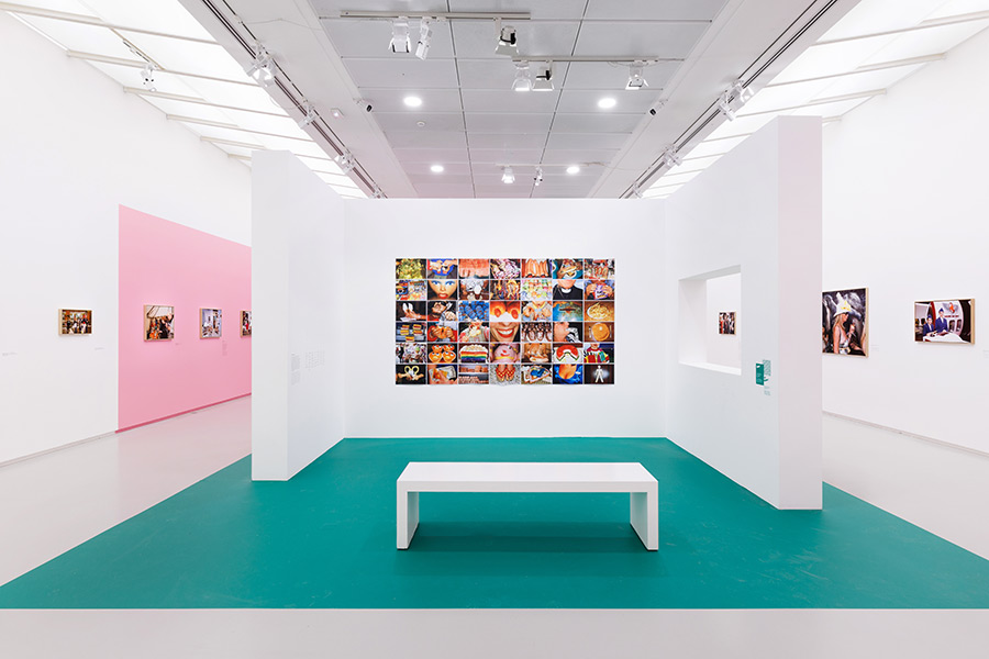
Fewer spaces but a clear, impactful journey, articulated into five themes relating to the critical, satirical dimension of Martin Parr’s documentary work. From the beach, a land of leisure to the animal kingdom and technological addictions, the exhibition crosses the decades and introduces each section with one to four black and white photographs from the 1970s or 1980s relating to these subjects, 1983 marking the constant use of color. This mix of eras, fluid to read, tends to show the constant interest held since its beginnings by Martin Parr in human beings in their social, economic and cultural dimensions. The choice of not having any vintage in the exhibition, but only photographs taken for the exhibition, 180 in total, contributes to this fluidity.
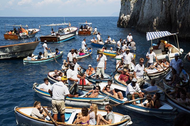
Martin Parr (1952-2025), Blue Grotto, Capri, Italy2014.
© Martin Parr / Magnum Photos
The bite and sharpness of these images seduce or annoy. In any case, they do not leave us indifferent and raise the question of perception – reception of this view by everyone on these images which have broadened the critical power of documentary photography to another aesthetic and another tone, not without questioning the content of the humor of their author judged by some to be condescending. The texts of rooms and cartels, but especially the text by Quentin Bajac in the catalog, give the ins and outs. Without them, however, what would it be like?
“Martin Parr loved pink”
Scenography. The scenography of “Martin Parr, Global Warning” was entrusted to Kevin Lebouvier. It is not the first that the designer-scenographer has designed in these places. Quentin Bajac had already asked him for the “Frank Horvat”, “Julia Margaret Cameron” and “Bertille Bak” exhibitions. For Martin Parr, he had to take into account, beyond the number of photographs (180) and the formats, the strong presence of his very colorful images “which require space and perspective”he emphasizes. To do this, Kevin Lebouvier has equipped each room with a specific layout incorporating a picture rail arranged in such a way as to guide the visitor in their circulation, while leaving the photographs the necessary space to breathe. Each structure is provided with an opening calibrated to the dimensions of the prints exhibited, so as to offer a point of view on those hanging on the other side and on the visitors who look at them, or even to photograph the scene in the style of Martin Parr. For the color of the walls, Kevin Lebouvier opted for white sequenced with colored sections of green and pastel pink. “ Martin Parr loved pink »specifies the scenographer. The location of the color and its variations in tone differ from one room to another, whether on the wall or on the floor. The font chosen – Alphabet Soup (designed by Steve Jackaman) – for the exhibition was, however, the responsibility of the communication of the art center which wished “ move towards a form evoking the seventies period, kitsch and popular, marking the start of the photographer’s career and recalling the aesthetic of postcards of the time”.